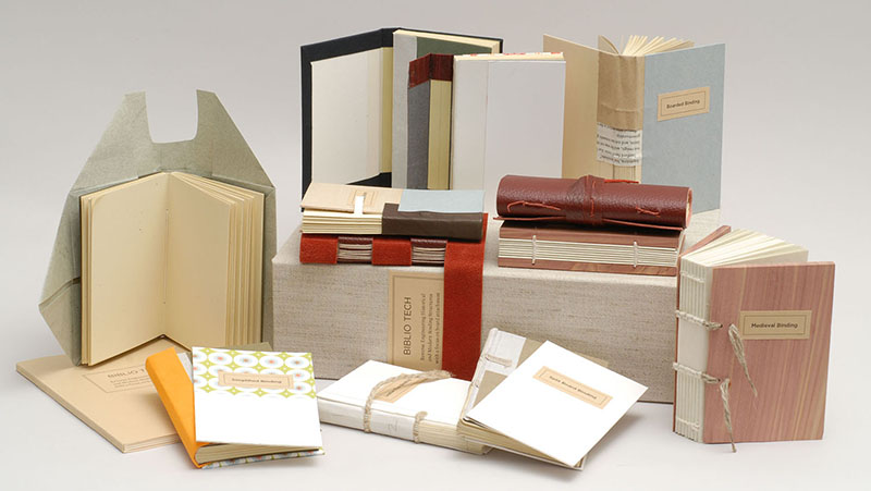
BookArtsLA, a new, nonprofit organization devoted to bringing the beauty of printing, binding and collecting artists’ and other hand made books to the public, has opened in Los Angeles. Its studio is located at 11720 Washington Place in westside area of Mar Vista. Our 1600 square foot space houses letterpresses, a bindery and workspace for up to 20 students. In our first few months we have offered classes in beginning and intermediate bookbinding, paste paper making, and have had guest lecturers Karen Hanmer and Rhiannon Alpers .

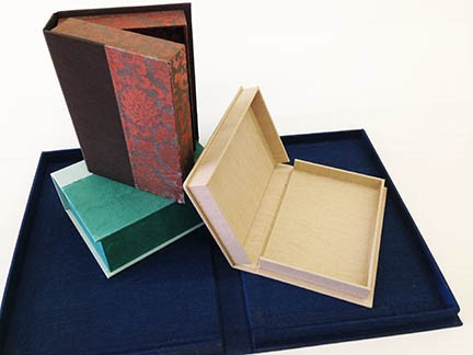
Rhiannon returns this weekend on June 13-14 to teach there different box forms to store books in. Over the summer, we will be presenting our popular paste paper making class and our One Day – Eight Books, an introduction to bookbinding structures. Michael Burke will be coming to teach a very special medieval binding. I will be teaching a one day introductory class in letterpress in July.
To learn more, visit their website BookArtsLA, and if you live in LA, do support them. If you can, please support this new and exciting venture in bookarts.
This year’s card (see next post) was not so much about printing as to remember a good friend. Phil was a general contractor and friend who helped me on technical issues with my presses. He would also devise any number of equipment that I dreamed up and had to have. We had many good times trying to figure out the solution to a problem. He also built a paper drying box for me, would put the die jacket on the press and alter tools, equipment and machines to my needs.
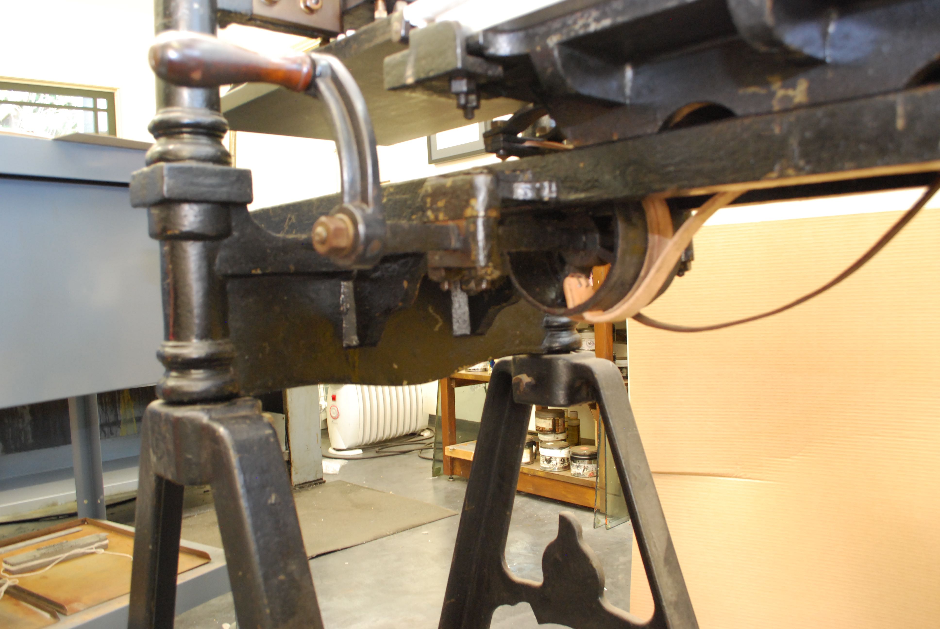
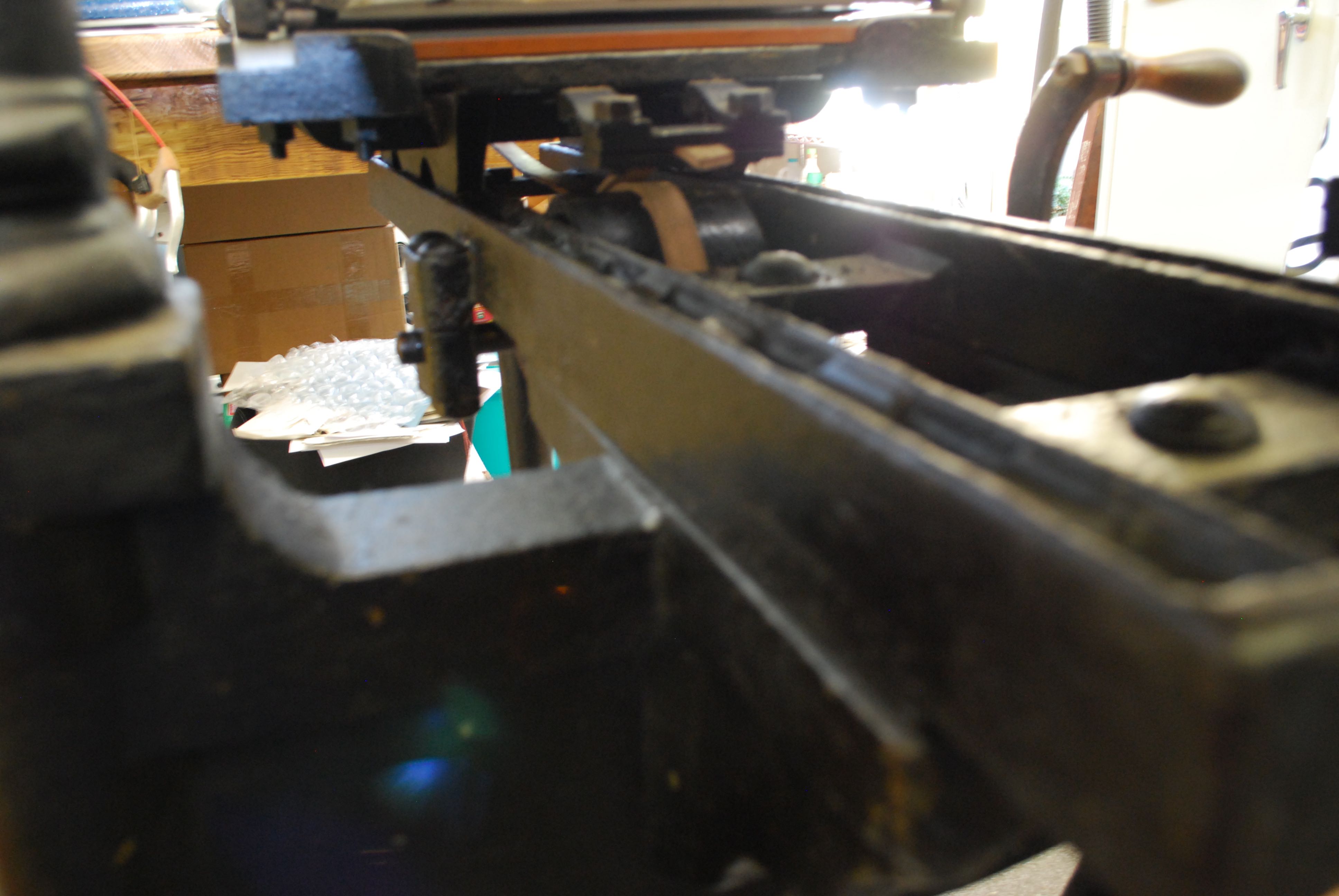
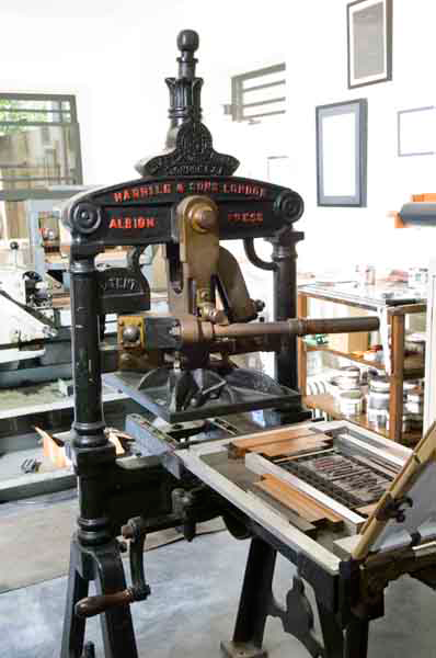
So maybe it was fitting that my Albion would quit on me while I was printing this year’s card. The leather straps that pull the bed under the platen finally gave out (we estimate they were around eighty years old). It should have been no problem to repair except there was no Phil. And no manual for a 100 year old press.
I consulted the books I had, including Gabriel Rummonds, Printing on the Iron Handpress. He gave a good solution but it didn’t work for me. I needed leather of a certain strength and thickness. I called my decorator, who rarely says no to me, and she called around.
She found the loveliest and amazing leather worker, Tony (http://www.yelp.com/biz/tonys-leather-goods-beverly-hills). After consulting together, he called around and went to the wholesaler early in the morning to get the leather I needed, then cut it to size and he got it to me within a few days. And with enough left over for a few belts.
Installation went smoothly and I had the press up and running within a day or two. It is wise to take pictures before you dismantle or remove parts and take a good hard look at what you are replacing. With the old presses, you need to be resourceful and bring a lot of ingenuity to the problem. And don’t throw anything away before successfully making the repair. You can see in the pictures, the new natural leather straps against the one original remaining. The surprising thing is that with the replacements the bed travels down the rails smoother than before.
Am I upset with Phil for not being here? A little, but through my solo repair job, I enjoyed wondering what his solution would have been. I bet it would have been ingenious.


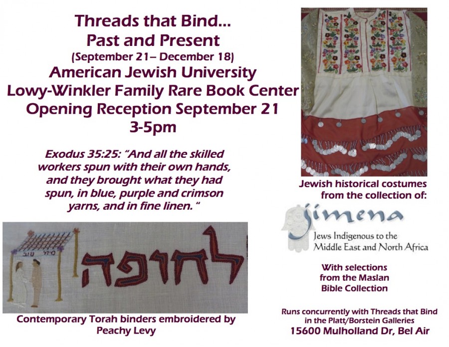
Wonderful news. I have been invited to exhibit two books in the AJU’s latest exhibition, The Thread That Binds, in collaboration with the American Textile Society. The exhibition shows textile religious and cultural artifacts from all over the world, antique and modern textile art.
The books are shown to display their binding and the different sewings that attach books to text. Among the books displayed is my book A Shelter of Stars by Howard Schawrtz in an exposed Japanese sewing with an offset cover. The second book is my about to be released The Guide: Maimonides’ Journey by Michael Castro (announcement forthcoming). The binding is based on the early American binding called the Scaleboard. It is a single-sheet book with the sheets bound together with leather tabs. The binding was often used for books of a religious nature.
The exhibition opens September 21 and runs through December 18. Hope you can visit if you are in Los Angeles.

The Newly Anointed
Hipster
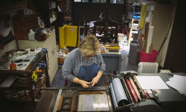
My new friend, Dersu Rhodes, just posted about our collaboration on his new business card. It was a pleasure to work with him and gratifying to feel that I contributed a piece to his newly started business as a graphic designer and art director.
Sometimes it can be daunting and distracting to have someone observing as you print, but with Dersu it was actually fun explaining to him what I was doing, how to set up the plate on the press, what happens when you run the press, and what to look for in a good printing.
And what a surprise to find myself anointed a hipster. It is not as if I were 30-something and up on all the latest. Thank you, Dersu.
Take a look at the images; they are some of the best I have seen of a small letterpress studio and were taken by Dersu.
See Dersu website.
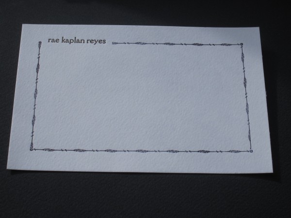
At best my family thinks it odd my interest in letterpress, but my sister has begun to get it. Now that she has the series of my broadsides and the books she sees the beauty of the imprinted page. She finally asked me to do some notecards and I was happy to oblige. It can be difficult working for a family member. But as far as any design constraints, she left it all to me. I finally got around to them last Winter.
First off I had to decide whether to go with polymer plate or metal type but rummaging through my type drawers decided that and I went with metal. My sister likes clean design, somewhat modern. Her signature is the most beautiful and cleanest handwriting ever. It is so perfect and consistent that one might think it was printed. She also signs in lower case.

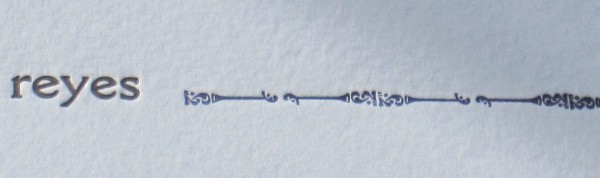
rae notecard detail
I needed a typeface that reflected that. The typeface Della Robbia, cast in 1903, takes its inspiration from 15th Florentine chisel cut initials yet has a modern feel and shape in its letters. Though Rae signs in cursive it mirrored the carefully constructed, exacting letterforms that she draws in her signature. The typeface is as clean and detailed as Rae’s signature.
I chose this border because it just seemed a good fit for a New York Upper Westsider. Maybe it reminds me of the old ironwork on New York city buildings. It is made of 2 pieces of type repeated in pairs to form the border. There are small floral corner pieces. The border was printed first and then the name was fitted in.
I printed them on my table top clamshell press. I wanted practise on the press and the single sheet notecards were a good opportunity. But I will reprint them on the Vandercook as it offers more control in the inking and the consistency of impression. Though with the tabletop one can get a deeper impression which was what I was going after.
She liked them so much that she used them all up and I will have to print some more. That’s a good sister and a happy customer.
Another year which brings another New Year’s piece. This year I knew I could not set a lot of type – it could not be a long piece like last year’s – as I am well into printing my next book, a narrative poem on Maimonides by Michael Castro – more about that soon, it is a big project and will likely be the subject of several blog posts.
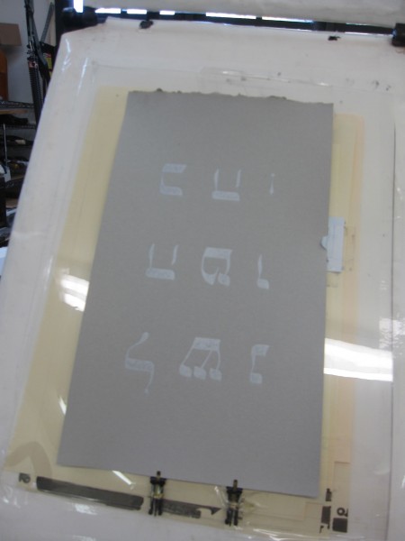
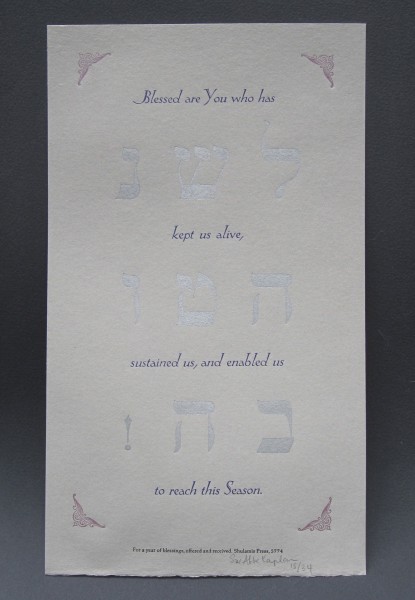
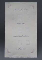
So this year’s card had to be more decorative. I have this Hebrew wooden type that I have not yet had an occasion to use. I decided that would be the design element. I decided to set the traditional holiday greeting, L’Shana Tova ( a wish for a Good New Year) with the wood type. The wood type and the joyous, exuberant greeting called for a joyous, spirited not too somber or serious accompanying text. As I went through my quote books, I remembered the Shehechianyu, the prayer we say as we approach or encounter the new. Perfect.
Adding as the third element a short line saying who printed it and when – known as the colophon – the design was completed.
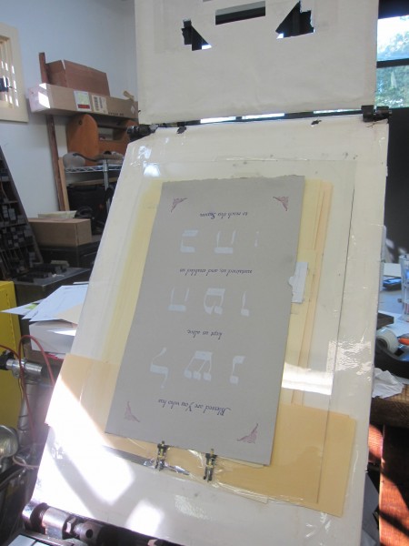
I had this beautiful gray paper I had hoped to use on the Maimonides but decided to go a different direction with the book. It is an elegant handmade paper by the Twinrocker Papermill. Choosing the colors for this paper required a lot of trial; I must have tried 10 different colors, from blues to greens and even a purple. A grey led to silver for the Hebrew perhaps reminding us of all the silver shined in preparation of the holiday.
For the Shehechianyu prayer in English I selected the typeface, Eve (or Eva, Locarno), one of my favorite typefaces (I will buy any of it that anyone can find). Eve, an elegant and lively, yet somewhat eccentric typeface was designed by Rudolf Koch in 1922. Koch was one of the preeminent type designers of the time (see, Warren Tracy, Letters of Credit, 1986.) I framed the whole piece with an Art Deco corner ornament in yet a third color. The final element, the Colophon was printed in Palatino typeface and in black.
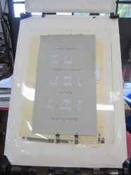
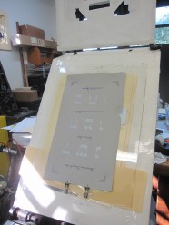
The piece was printed on the Albion where I could give the thick paper a good impression (the paper was very hard and didn’t take an impression easily.) The Albion press is a hand press and each sheet must placed on the frisket, a protective frame that prevents ink from being transferred to the paper. The paper is placed under the frisket, where a “window” has been cut out for the printing area and the paper is sent through the press for impression and printing. Each area to be printed sometimes requires a new window to be cut and attached to the frisket.
I think the elements came together very nicely: the silver wood type, the bright blue of the Eve typeface, and the more somber red of the corners. The silver reflects on the silver bindings popular for Jewish prayerbooks in the 18th-19th centuries and the Eve with its tall ascenders and capitals that is maybe not unlike the Rashi script connect us to the traditions and customs associated with our holiday.
The Details: Printed on the Albion Press on Twinrocker paper,
14 in. x 9 in. in an edition of 34.
As the world was approaching the new New Year, I was still working on my old New Year’s card , my yearly Rosh Hashanah greeting. I can’t remember if I ever got any one out in time. I want to describe here how this card came to realization, a little about the text, a little about the design and printing.
I try to do something different every year, the text of course, but I like to try new things typographically. Sometimes it is with ornaments, sometimes it is with the layout of the piece, sometimes using a different printing press. Each offers a challenge. Each, I hope, reflects the Rosh Hashanah holidays.
The idea for a recipe card came quickly. Some of my best times are with friends and family centered around food. Shabbat dinners, interesting restaurants and my other passion, the quest for that perfect latte come to mind. And our holidays do have a food component, that can sometimes eclipse the holiday’s actual meaning.
I have been thinking about a book about food; what kind of cookbook, book of recipes, or a food-centric work I don’t know yet. I haven’t come up with anything yet but doing a recipe card was a good way to start.
What is the most quintessential (or some might think essential) dish all Jews partake of in one form or another? Tzimmes! I personally do not find it an appealing dish so I searched for a more palatable recipe than the traditional ones. I had Jayne Cohen’s book, The Gefilte Variations, in my library and enjoyed how she freshened up the flavorings in the traditional Ashkenzic dishes.
Tzimmes also has a meaning of tumult, a fuss, uproar. Taking that meaning, that most of our daily lives can be such a tzimmes and the holidays come to re-focus us, I also played with the ‘tz’ sound and paired it with my recipe of an antidote to the tumult in our lives. Using Tephila, T’shivah and Tzedakah, the three things we are asked to observe from the Unetaneh Tokef) prayer to lessen our fates: thus a tzimmes recipe to eat and a ‘tzimmes’ recipe to contemplate (http://en.wikipedia.org/wiki/Unetanneh_Tokef).
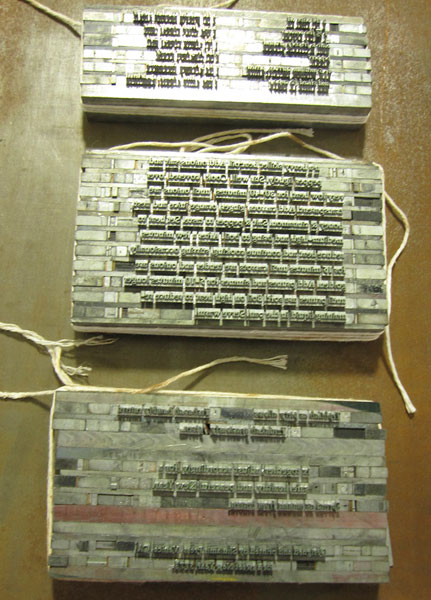
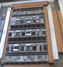
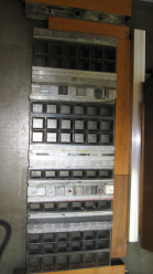
Can setting metal type also become a tzimmes? All those pieces of type and spacing assembled together to form words, sentences, to become a text? [insert image metal type] Maybe. I used two typefaces: Weiss, in roman and italic, for the text and Eve for the title. I am very fond of Weiss designed by the German typographer Emil Rudolf Weiss (1896 – 1965; http://en.wikipedia.org/wiki/Emil_Weiss; for a recent book about Weiss, printed letterpress, see http://www.inclinepress.com/ERWeiss.html). The typeface is available digitally but I am fortunate to have it in metal and I used this to handset the piece.I complemented the type with leaf ornaments, also designed by Emil Weiss.
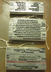
Recipe handset in Weiss typeface
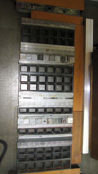
On the Press: Weiss ornaments and Initials to be printed in brown
After setting the type and designing the layout, we are ready to begin the printing process. I decided to use three colors, using colors to suggest autumn. That means that I will do three runs – the paper will be printed three times, one for each color. The type has to be separated into the three color runs and set up on the press so that that all the elements fall into the right place in the finished piece [take a picture]. This is not always easy and takes some trial and error to get each form – the individual pages of type – in its right place.I’ll leave off here leaving printing for another day except to say I printed it on my Albion handpress, a press built in England, 1902. It is not the easiest presses to use but very satisfying as every step is determined by touch and feel from the inking to impression.I decided to use three colors, using colors to suggest autumn. That means that I will do three runs – the paper will be printed three times, one for each color. The type has to be separated into the three color runs and set up on the press so that that all the elements fall into the right place in the finished piece [take a picture]. This is not always easy and takes some trial and error to get each form – the individual pages of type – in its right place. I’ll leave off here, leaving printing for another day except to say I printed it on my Albion handpress, a press built in England, 1902. It is not the easiest presses to use but very satisfying as every step is determined by touch and feel from the inking to impression.
The piece is printed, my friends received it and my hope for everyone is that our year is full of humility, graciousness and generosity. Shana Tova.
The Details: 5 x 7 in. Printed on Rives BFK paper in Weiss Roman and Italic, title in Eve with Weiss leaf ornaments, in three colors. Unsigned in an edition of 35. Printed on the Albion handpress.
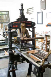
Albion Handpress
- Tzimmes
I was just reminded by a friend that the holidays are coming up soon and then he asked have I begun to think about my card yet. Of course not. But now I will. Can’t tell you all what I am thinking or the surprise will be ruined but I think it will be more traditional in format this year.
The design and printing of the card is my Elul, the month preceding the holiday where one begins the preparation of thought and deed in anticipation of the Holiday season. I look back on the year I have had and forward to the one I am hoping for. I think about what has been important to me, what I care most about, and build my piece from there.
More as we enter the month of Elul.
This is the blog to my web site. Thank you for taking a look. It is meant to accompany the web site: to add, to elaborate, to think. To display newer work, to show progress of current work and to highlight an older work in more detail than possible on the web site.
I am not sure what I will talk about yet. I have read many of your printing blogs out there and don’t know if I will follow their leads as to topics, whether to add the personal (probably not), and structure.
It might be a laboratory of the tried and experimental, maybe including the disappointments as well the successes. It might be a place to encourage sharing, to seek advice and solutions.
Welcome to my new site and blog. I look forward to reading your comments. Thanks, Sue