The Old New Year
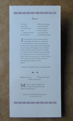
As the world was approaching the new New Year, I was still working on my old New Year’s card , my yearly Rosh Hashanah greeting. I can’t remember if I ever got any one out in time. I want to describe here how this card came to realization, a little about the text, a little about the design and printing.
I try to do something different every year, the text of course, but I like to try new things typographically. Sometimes it is with ornaments, sometimes it is with the layout of the piece, sometimes using a different printing press. Each offers a challenge. Each, I hope, reflects the Rosh Hashanah holidays.
The idea for a recipe card came quickly. Some of my best times are with friends and family centered around food. Shabbat dinners, interesting restaurants and my other passion, the quest for that perfect latte come to mind. And our holidays do have a food component, that can sometimes eclipse the holiday’s actual meaning.
I have been thinking about a book about food; what kind of cookbook, book of recipes, or a food-centric work I don’t know yet. I haven’t come up with anything yet but doing a recipe card was a good way to start.
What is the most quintessential (or some might think essential) dish all Jews partake of in one form or another? Tzimmes! I personally do not find it an appealing dish so I searched for a more palatable recipe than the traditional ones. I had Jayne Cohen’s book, The Gefilte Variations, in my library and enjoyed how she freshened up the flavorings in the traditional Ashkenzic dishes.
Tzimmes also has a meaning of tumult, a fuss, uproar. Taking that meaning, that most of our daily lives can be such a tzimmes and the holidays come to re-focus us, I also played with the ‘tz’ sound and paired it with my recipe of an antidote to the tumult in our lives. Using Tephila, T’shivah and Tzedakah, the three things we are asked to observe from the Unetaneh Tokef) prayer to lessen our fates: thus a tzimmes recipe to eat and a ‘tzimmes’ recipe to contemplate (http://en.wikipedia.org/wiki/Unetanneh_Tokef).
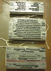
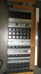
Can setting metal type also become a tzimmes? All those pieces of type and spacing assembled together to form words, sentences, to become a text? [insert image metal type] Maybe. I used two typefaces: Weiss, in roman and italic, for the text and Eve for the title. I am very fond of Weiss designed by the German typographer Emil Rudolf Weiss (1896 – 1965; http://en.wikipedia.org/wiki/Emil_Weiss; for a recent book about Weiss, printed letterpress, see http://www.inclinepress.com/ERWeiss.html). The typeface is available digitally but I am fortunate to have it in metal and I used this to handset the piece.I complemented the type with leaf ornaments, also designed by Emil Weiss.
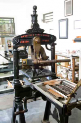
After setting the type and designing the layout, we are ready to begin the printing process. I decided to use three colors, using colors to suggest autumn. That means that I will do three runs – the paper will be printed three times, one for each color. The type has to be separated into the three color runs and set up on the press so that that all the elements fall into the right place in the finished piece [take a picture]. This is not always easy and takes some trial and error to get each form – the individual pages of type – in its right place.I’ll leave off here leaving printing for another day except to say I printed it on my Albion handpress, a press built in England, 1902. It is not the easiest presses to use but very satisfying as every step is determined by touch and feel from the inking to impression.I decided to use three colors, using colors to suggest autumn. That means that I will do three runs – the paper will be printed three times, one for each color. The type has to be separated into the three color runs and set up on the press so that that all the elements fall into the right place in the finished piece [take a picture]. This is not always easy and takes some trial and error to get each form – the individual pages of type – in its right place. I’ll leave off here, leaving printing for another day except to say I printed it on my Albion handpress, a press built in England, 1902. It is not the easiest presses to use but very satisfying as every step is determined by touch and feel from the inking to impression.
The piece is printed, my friends received it and my hope for everyone is that our year is full of humility, graciousness and generosity. Shana Tova.
The Details: 5 x 7 in. Printed on Rives BFK paper in Weiss Roman and Italic, title in Eve with Weiss leaf ornaments, in three colors. Unsigned in an edition of 35. Printed on the Albion handpress.


Bravo Sue!!! Looks good.
Thanks, Sue, it is always interesting to me to learn more about how you do what you do. And I treasure each and every one of your cards – and “card” seems quite an inadequate word to describe what they are.
Definitely looking forward to a food book!