Another year which brings another New Year’s piece. This year I knew I could not set a lot of type – it could not be a long piece like last year’s – as I am well into printing my next book, a narrative poem on Maimonides by Michael Castro – more about that soon, it is a big project and will likely be the subject of several blog posts.
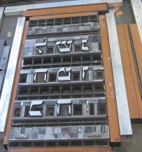
So this year’s card had to be more decorative. I have this Hebrew wooden type that I have not yet had an occasion to use. I decided that would be the design element. I decided to set the traditional holiday greeting, L’Shana Tova ( a wish for a Good New Year) with the wood type. The wood type and the joyous, exuberant greeting called for a joyous, spirited not too somber or serious accompanying text. As I went through my quote books, I remembered the Shehechianyu, the prayer we say as we approach or encounter the new. Perfect.
Adding as the third element a short line saying who printed it and when – known as the colophon – the design was completed.
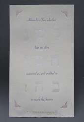
I had this beautiful gray paper I had hoped to use on the Maimonides but decided to go a different direction with the book. It is an elegant handmade paper by the Twinrocker Papermill. Choosing the colors for this paper required a lot of trial; I must have tried 10 different colors, from blues to greens and even a purple. A grey led to silver for the Hebrew perhaps reminding us of all the silver shined in preparation of the holiday.
For the Shehechianyu prayer in English I selected the typeface, Eve (or Eva, Locarno), one of my favorite typefaces (I will buy any of it that anyone can find). Eve, an elegant and lively, yet somewhat eccentric typeface was designed by Rudolf Koch in 1922. Koch was one of the preeminent type designers of the time (see, Warren Tracy, Letters of Credit, 1986.) I framed the whole piece with an Art Deco corner ornament in yet a third color. The final element, the Colophon was printed in Palatino typeface and in black.
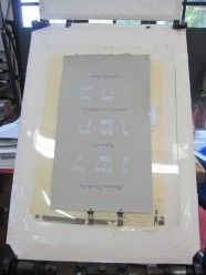
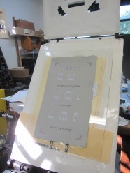
The piece was printed on the Albion where I could give the thick paper a good impression (the paper was very hard and didn’t take an impression easily.) The Albion press is a hand press and each sheet must placed on the frisket, a protective frame that prevents ink from being transferred to the paper. The paper is placed under the frisket, where a “window” has been cut out for the printing area and the paper is sent through the press for impression and printing. Each area to be printed sometimes requires a new window to be cut and attached to the frisket.
I think the elements came together very nicely: the silver wood type, the bright blue of the Eve typeface, and the more somber red of the corners. The silver reflects on the silver bindings popular for Jewish prayerbooks in the 18th-19th centuries and the Eve with its tall ascenders and capitals that is maybe not unlike the Rashi script connect us to the traditions and customs associated with our holiday.
The Details: Printed on the Albion Press on Twinrocker paper,
14 in. x 9 in. in an edition of 34.


