This year’s card (see next post) was not so much about printing as to remember a good friend. Phil was a general contractor and friend who helped me on technical issues with my presses. He would also devise any number of equipment that I dreamed up and had to have. We had many good times trying to figure out the solution to a problem. He also built a paper drying box for me, would put the die jacket on the press and alter tools, equipment and machines to my needs.
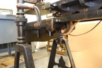
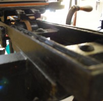
So maybe it was fitting that my Albion would quit on me while I was printing this year’s card. The leather straps that pull the bed under the platen finally gave out (we estimate they were around eighty years old). It should have been no problem to repair except there was no Phil. And no manual for a 100 year old press.
I consulted the books I had, including Gabriel Rummonds, Printing on the Iron Handpress. He gave a good solution but it didn’t work for me. I needed leather of a certain strength and thickness. I called my decorator, who rarely says no to me, and she called around.
She found the loveliest and amazing leather worker, Tony (http://www.yelp.com/biz/tonys-leather-goods-beverly-hills). After consulting together, he called around and went to the wholesaler early in the morning to get the leather I needed, then cut it to size and he got it to me within a few days. And with enough left over for a few belts.
Installation went smoothly and I had the press up and running within a day or two. It is wise to take pictures before you dismantle or remove parts and take a good hard look at what you are replacing. With the old presses, you need to be resourceful and bring a lot of ingenuity to the problem. And don’t throw anything away before successfully making the repair. You can see in the pictures, the new natural leather straps against the one original remaining. The surprising thing is that with the replacements the bed travels down the rails smoother than before.
Am I upset with Phil for not being here? A little, but through my solo repair job, I enjoyed wondering what his solution would have been. I bet it would have been ingenious.


The Newly Anointed
Hipster
My new friend, Dersu Rhodes, just posted about our collaboration on his new business card. It was a pleasure to work with him and gratifying to feel that I contributed a piece to his newly started business as a graphic designer and art director.
Sometimes it can be daunting and distracting to have someone observing as you print, but with Dersu it was actually fun explaining to him what I was doing, how to set up the plate on the press, what happens when you run the press, and what to look for in a good printing.
And what a surprise to find myself anointed a hipster. It is not as if I were 30-something and up on all the latest. Thank you, Dersu.
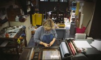
Take a look at the images; they are some of the best I have seen of a small letterpress studio and were taken by Dersu.
See Dersu website.
At best my family thinks it odd my interest in letterpress, but my sister has begun to get it. Now that she has the series of my broadsides and the books she sees the beauty of the imprinted page. She finally asked me to do some notecards and I was happy to oblige. It can be difficult working for a family member. But as far as any design constraints, she left it all to me. I finally got around to them last Winter.
First off I had to decide whether to go with polymer plate or metal type but rummaging through my type drawers decided that and I went with metal. My sister likes clean design, somewhat modern. Her signature is the most beautiful and cleanest handwriting ever. It is so perfect and consistent that one might think it was printed. She also signs in lower case.


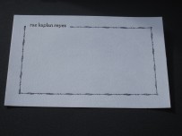
rae notecard detail
I needed a typeface that reflected that. The typeface Della Robbia, cast in 1903, takes its inspiration from 15th Florentine chisel cut initials yet has a modern feel and shape in its letters. Though Rae signs in cursive it mirrored the carefully constructed, exacting letterforms that she draws in her signature. The typeface is as clean and detailed as Rae’s signature.
I chose this border because it just seemed a good fit for a New York Upper Westsider. Maybe it reminds me of the old ironwork on New York city buildings. It is made of 2 pieces of type repeated in pairs to form the border. There are small floral corner pieces. The border was printed first and then the name was fitted in.
I printed them on my table top clamshell press. I wanted practise on the press and the single sheet notecards were a good opportunity. But I will reprint them on the Vandercook as it offers more control in the inking and the consistency of impression. Though with the tabletop one can get a deeper impression which was what I was going after.
She liked them so much that she used them all up and I will have to print some more. That’s a good sister and a happy customer.

